


A graphic tee can anchor an outfit without making every look feel repetitive. The Represent Owners Club TShirt Flat White Black and Represent Owners Club TShirt Powder Blue show how one familiar graphic direction can create two very different styling moods.
The Flat White Black option feels sharper and more immediate. Powder Blue feels softer and less expected. Choosing between them is not only about color preference. It is about deciding how much contrast you want the tee to bring into your everyday rotation.
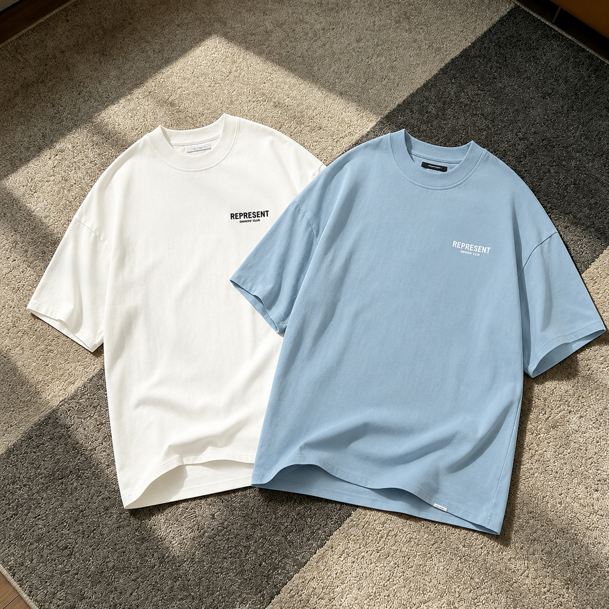
One Owners Club Identity Two Different Outfit Directions
The Owners Club range has become one of Represent’s most recognizable graphic lines. Its visual language takes cues from vintage car owners’ clubs and shared community identity. You can explore the official Represent Owners Club collection for more background on the series.
Both tees keep the same clear graphic structure. Branding appears at the chest and across the back, giving the shirts a balanced front-to-back presence. The design stays noticeable without feeling difficult to wear.
Flat White Black Creates A Cleaner Contrast
The Represent Owners Club TShirt Flat White Black works best when you want the tee to create a strong visual break. The flat white base and darker graphic details keep the look crisp. This makes the shirt easy to style with darker bottoms.
For a simple city outfit, pair it with black straight-leg trousers and low-profile sneakers. The contrast already gives the outfit enough structure. Washed black denim works too, especially when you want a slightly rougher streetwear feel.
During warmer weather, dark shorts and longer white socks keep the outfit balanced. The lighter tee opens up the upper half. The darker lower half stops the look from becoming too soft.
Powder Blue Gives The Graphic A Softer Mood
The Represent Owners Club TShirt Powder Blue shifts the same graphic idea into a calmer direction. The blue base feels more relaxed than a standard white or black tee. It adds color without becoming difficult to repeat.
This option works well with faded denim, soft grey sweatpants, or off-white shorts. These combinations keep the palette light and controlled. They also make the tee feel distinct from more common graphic shirt choices.
White sneakers and grey runners are natural pairings. A darker shoe creates more contrast, but a lighter shoe keeps the overall look cleaner. Powder Blue is the stronger choice when your wardrobe already contains enough monochrome tees.
What Both Tees Keep Consistent
Both shirts follow the recognizable Owners Club formula. Represent lists a 220gsm cotton construction, crewneck shape, short sleeves, front and back graphic branding, a logo bar near the hem, and production in Portugal.
The fit is designed to feel relaxed rather than narrow. When choosing a size, think about how the tee will sit with your usual pants or shorts. A wider top works naturally with straight-leg trousers, relaxed denim, and simple summer shorts.
If you plan to layer the tee, keep the outer layer open. A lightweight overshirt or zip hoodie lets the front graphic remain visible. Avoid combining too many oversized layers, especially when the tee is already carrying a wider shape.
Which Color Makes More Sense For Your Rotation
Choose Flat White Black when you want an easy graphic tee for darker outfits. It works naturally with black trousers, washed denim, simple sneakers, and repeatable daily combinations.
Choose Powder Blue when you want to move away from the usual neutral rotation. It keeps the Owners Club identity but brings a softer color into the outfit. The result feels more relaxed without losing the graphic focus.
You can browse the Represent collection at AFV to compare both colorways with other Represent pieces. Looking at the wider range makes it easier to decide which option fills a real gap in your wardrobe.
Two Colors With Separate Reasons To Wear Them
Owning both tees does not feel repetitive when each one has a clear role. Flat White Black handles sharper outfits with stronger contrast. Powder Blue works better for lighter palettes and more relaxed days.
The graphic language stays consistent, but the mood changes completely. One option feels crisp and direct. The other feels softer and more understated. That difference gives both shirts a practical place in a weekly rotation.
Share:
MM6 Maison Margiela Zoom Logo Oversized TShirt In Focus