


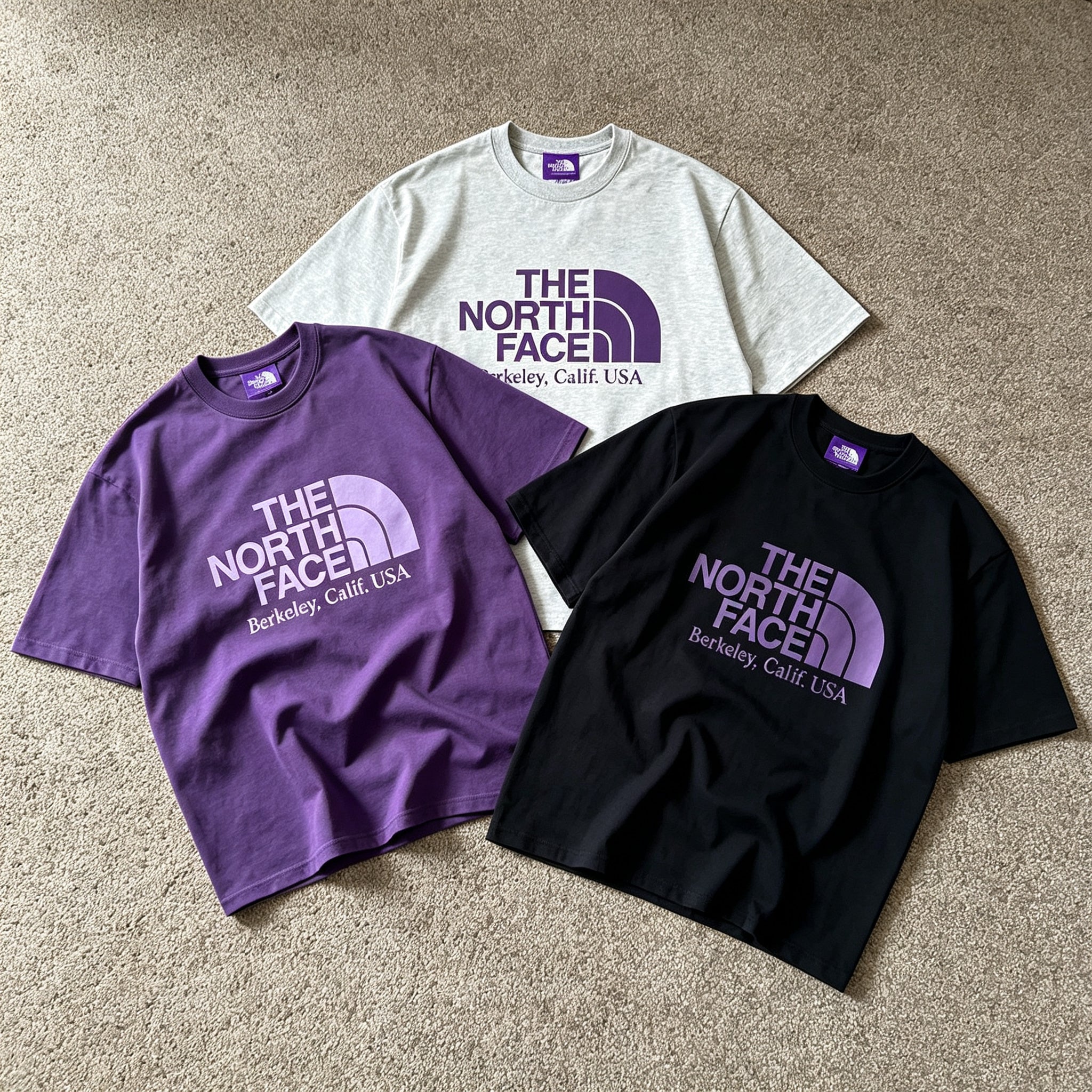
Some collaboration tees are easiest to understand when you stop treating them like isolated statement pieces. The Palace x The North Face Purple Label Field Graphic Tshirt, Palace Purple Label Graphic Detail Cotton Tshirt, and PALACE THE NORTH FACE PURPLE LABEL FIELD GRAPHIC TEE BLACK make more sense as a small rotation. Each one changes the mood without forcing you to rebuild the entire outfit.
The common thread is clear. Palace brings a direct streetwear attitude. The North Face Purple Label adds an outdoor-informed layer to the visual language. The result is not a uniform. It is a set of graphic tees that can move through different parts of the week.
Begin With The Collaboration Story Not A Full Technical Outfit
The official Palace and The North Face Purple Label release gives the wider capsule its context. That context matters, but it does not mean every outfit needs to look like a hiking setup. A graphic tee is the easier entry point.
Instead of stacking several outdoor references together, let one detail carry the idea. The tee can sit with relaxed trousers on a weekday, shorts during a warmer afternoon, or denim for a low-effort weekend look. The collaboration stays visible without becoming costume-like.
The Field Graphic Tshirt Belongs In The Middle Of The Outfit
The Palace x The North Face Purple Label Field Graphic Tshirt is the piece to start with when you want the graphic to establish the direction. It has enough identity to lead the outfit, but it still leaves room for simple layers and familiar bottoms.
Try it on a day when you want the tee to do most of the visual work. Keep the pants straightforward. Use one clean sneaker shape. Add an open overshirt only when the weather calls for it. That restraint gives the graphic space and keeps the outfit from looking overplanned.
This approach is especially useful when you are moving between casual settings. The tee can work for a daytime coffee stop, a city walk, or an evening plan without requiring a complete change. The graphic brings the collaboration into view, while the rest of the outfit stays flexible.
The Grey Cotton Tee Creates A Breathing Point
The Palace Purple Label Graphic Detail Cotton Tshirt has a quieter place in the rotation. Its grey base changes the pace. It can sit between louder pieces and still keep the Palace Purple Label connection present.
This is the tee for days when the outfit already has enough going on. Maybe the pants have more volume. Maybe the sneakers have a stronger shape. Maybe you want to carry an outer layer without making every part compete for attention. The grey foundation gives the outfit a pause.
It also works when you want the graphic to feel discovered rather than announced. From a distance, the shirt can read like an easy daily layer. Up close, the detail gives it a sharper identity than a blank basic. That difference makes it useful beyond a single styled look.
The Black Field Graphic Tee Handles Later Hours
The PALACE THE NORTH FACE PURPLE LABEL FIELD GRAPHIC TEE BLACK brings more weight into the rotation. The black base naturally feels more grounded. It is a strong option when you want the graphic direction to stay visible inside a darker outfit.
This version makes sense later in the day, especially when a lighter tee feels too open. Use it with washed denim when you want separation between the top and bottom. Wear it with tonal trousers when you want the silhouette to feel more continuous. A single lighter accessory can stop the outfit from becoming flat.
The advantage is control. The shirt can hold its own without needing extra graphics nearby. A simple jacket, a structured bag, or a textured pant is enough. The outfit feels considered, but it does not look like every collaboration detail was added at once.
Rotate The Tees By Energy Rather Than Occasion
The easiest way to use all three shirts is not to assign them strict rules. Think about energy instead. Start with the Field Graphic Tshirt when you want the collaboration to be the first thing people notice. Move to the grey cotton tee when the outfit needs more room. Reach for the black Field Graphic Tee when you want a darker center.
That creates a natural weekly rhythm. One tee leads. One tee settles the outfit down. One tee brings more weight. The rest of your wardrobe can remain consistent, which is exactly why the rotation works.
You do not need three completely different pairs of shoes or separate styling formulas. The changes can be small. Switch from denim to relaxed trousers. Replace shorts with a longer pant. Add an open layer when the temperature drops. The tees keep the overall direction connected.
A Collaboration Works Better When You Leave Space Around It
The main styling mistake is trying to make every part of the outfit prove the collaboration theme. Too many graphics make the tee less effective. Too many technical references can make a casual shirt feel harder to wear.
Use one strong idea at a time. Let the Field Graphic Tshirt carry a simple daytime look. Let the grey cotton tee create a quieter outfit with more texture elsewhere. Let the black Field Graphic Tee anchor an evening rotation without disappearing into a plain all-black setup.
Browse the Palace selection at AFV to compare the three tees alongside other Palace pieces. The best choice is not automatically the loudest graphic. It is the one that gives your current wardrobe a new role without forcing a new uniform.
Share:
Represent Owners Club TShirt In Two Color Moods