
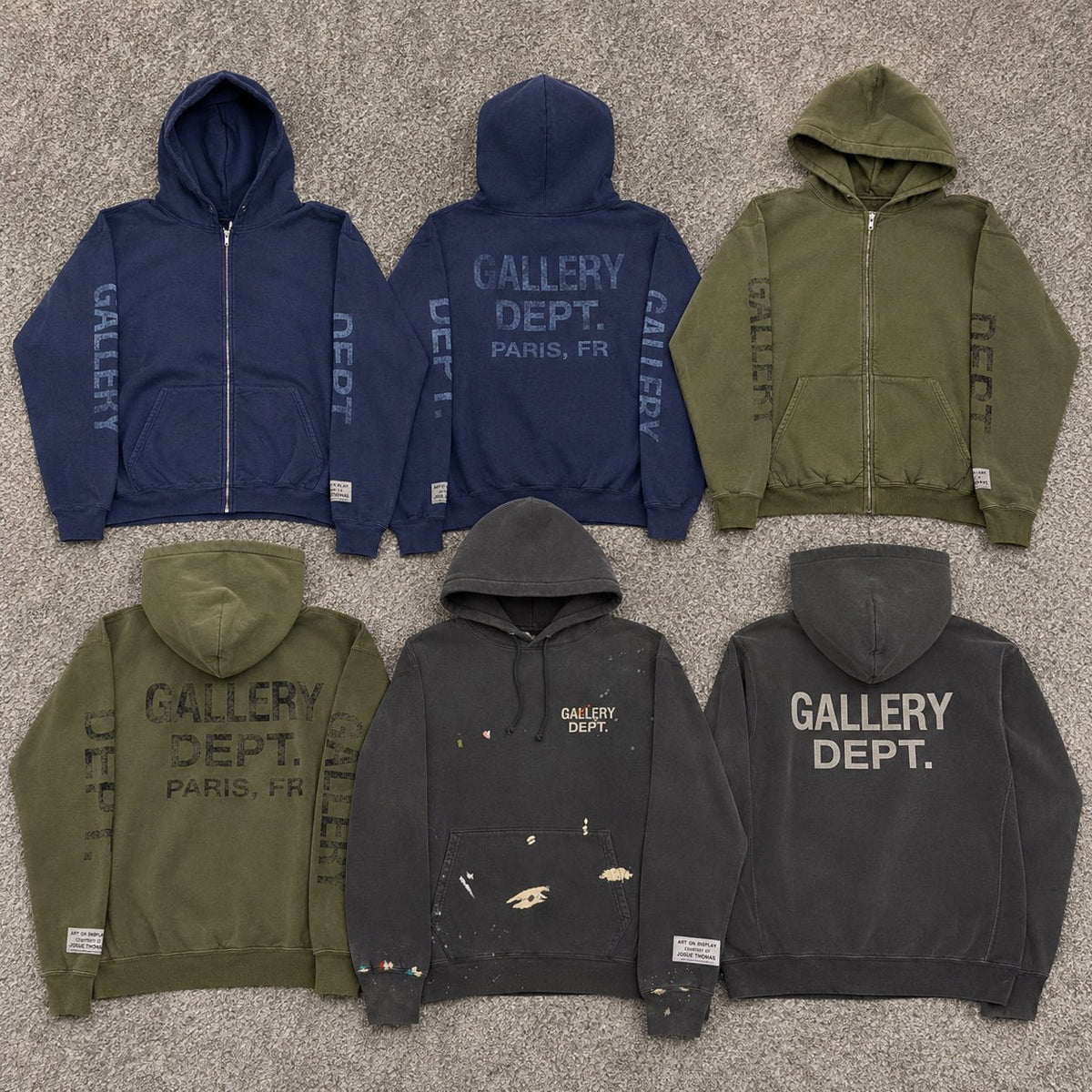
Gallery Dept 90s Logo Zip Up Hoodie Olive, Gallery Dept. 90s Logo Zip Up Hoodie Navy, and Gallery Dept. GD Paint Logo Hoodie Vintage Black are connected by one of the brand’s most recognizable ideas: color should not look completely flat or untouched. All three use special wash treatments to give the hoodie surface a more aged character, but the result changes with the base color and construction. Olive becomes softer and more worn-looking, Navy gains depth without becoming plain dark blue, and Vintage Black pushes the idea furthest through a patented fading process and hand-painted marks.
The Wash Is Part of the Design, Not an Afterthought
These hoodies make more sense when the washed surface is treated as a design feature rather than simply a color description. A standard solid-color hoodie aims for an even finish. Gallery Dept. uses washing and fading to move in the opposite direction, allowing the fabric to look less uniform and more lived-in.
That difference is especially important on simple hoodie shapes. When there are no complex panels or bright all-over graphics, the surface itself has to create character. The wash gives Olive, Navy, and Vintage Black more visual depth before the logo or zipper is considered.
This is the main reason these pieces feel different from ordinary solid-color sweatshirts.
Olive Looks Better Because the Green Is Not Too Clean
On the Gallery Dept 90s Logo Zip Up Hoodie Olive, the special wash works with the muted green rather than fighting it. Instead of reading like a fresh military green or a sharply saturated fashion color, the Olive body takes on a more aged streetwear character.
That softened surface makes the hoodie easier to pair with faded black denim, worn grey pants, cream tees, and other colors that already have some visual softness. The washed effect prevents the green from feeling disconnected from distressed or vintage-inspired pieces.
The full zip also helps because the Olive surface can be broken up by whatever is worn underneath. Open it over a faded black or off-white tee and the washed green becomes the frame rather than one uninterrupted block.
Olive is the strongest choice when you want the wash to make color feel more relaxed and worn-in.
Navy Uses the Same Idea in a Darker Direction
The Navy 90s Logo Zip Up Hoodie starts from a deeper base, so the purpose of the wash changes. Navy can easily become visually flat when the color is too uniform. A washed treatment gives the darker surface more variation and helps prevent it from looking like a basic school or sportswear navy hoodie.
That makes this version useful for someone who prefers dark clothes but does not want another completely flat black or navy layer. The color remains controlled, while the aged finish introduces enough irregularity to keep the surface interesting.
Wear it with grey, washed denim, or faded black pants and the hoodie stays inside a darker palette without losing definition.
Navy is the more restrained washed option of the two 90s Zip Hoodies.
The 90s Zip Hoodies Let the Wash Support the Outfit
On both Olive and Navy, the special wash does not need to become the only thing you notice. The 90s-inspired logo and full front zip still play important roles, but the faded color treatment creates the background that makes those details feel more natural.
This is why the two zip hoodies work particularly well as layers. Wear them open and the aged surface surrounds a cleaner tee. Zip them up and the washed body becomes more dominant.
The effect is subtle but useful: the hoodie can look vintage-influenced without needing heavy paint marks across the entire garment.
Vintage Black Takes the Wash Much Further
Gallery Dept. GD Paint Logo Hoodie Vintage Black treats washing as a much more obvious artistic process. Gallery Dept. officially documents a patented wash process using unique fading techniques across each piece, including the logos and graphics.
That means the Vintage Black color is not simply a softer version of black. The wash is intended to affect the entire visual surface, creating variations in the fabric and printed areas rather than preserving one perfectly even shade.
The exact GD Paint Logo Hoodie from Gallery Dept. also confirms that the pieces are hand-painted by artisans at the brand’s Los Angeles maison.
Of these three hoodies, Vintage Black is where the wash becomes the most explicit part of the product identity.
Paint and Fading Work Together on the GD Paint Hoodie
The hand-painted marks would already make the hoodie visually different, but the fading underneath changes how those marks sit on the garment. Instead of bright paint appearing on a perfectly new black base, it is placed over a surface that already looks aged.
The front carries a smaller GD ENGLISH logo while the back uses an enlarged version, and the patented wash also affects those graphic elements. This connects the branding, cotton body, and paint into one worn visual language.
That relationship is important. The paint does not look like decoration added to a finished basic hoodie; it becomes part of a surface that has already been intentionally altered.
The Three Colors Show Three Different Results of Washing
Olive demonstrates how washing can soften a color. The green feels easier to combine with faded denim, charcoal, cream, and other muted tones because the surface already has a broken-in character.
Navy demonstrates how washing can add depth to a dark color. It remains restrained but avoids the completely uniform appearance of a conventional navy sweatshirt.
Vintage Black demonstrates how washing can become an artistic treatment in its own right. Unique fading combines with hand painting and front-and-back branding, making surface variation one of the first things you notice.
The three pieces share the idea of aging the garment, but they do not produce the same visual result.
Wear Olive and Navy as Washed Layers
For Olive, try a cream or faded black tee underneath with washed dark denim. Leave the zipper partly open so the clean base layer contrasts with the aged green surface.
For Navy, use a light grey or off-white tee with charcoal trousers or faded blue denim. The darker washed hoodie frames the lighter center while keeping the overall palette controlled.
In both outfits, the special wash supports the layering rather than becoming the only focal detail.
Let Vintage Black Carry the Surface Detail
The GD Paint Hoodie needs less help. The washed Vintage Black body, paint marks, logos, and fading already create enough variation across the garment.
Pair it with simpler faded black jeans, grey trousers, or plain denim and let the hoodie remain the main source of texture. Adding another heavily distressed or painted top can make the different surface treatments compete with each other.
Vintage Black works best when the wash and hand-painted details are allowed to lead.
Choose by How Strong You Want the Wash to Feel
Choose the Olive 90s Logo Zip Up Hoodie when you want the special wash to soften a green outer layer and fit naturally into muted, vintage-influenced outfits.
Choose Navy when you prefer a darker color but still want the surface to have more character than a standard solid navy hoodie.
Choose the GD Paint Logo Hoodie Vintage Black when the washing process itself is part of the reason you are buying. Its patented fading treatment, hand-painted marks, and altered graphics make the surface much more central to the design.
You can browse Gallery Dept. at AFewVibe after deciding whether you want the wash to work quietly through color or become the main artistic feature of the hoodie.
All three show why Gallery Dept. does not treat color as a flat finish. Olive is softened, Navy is deepened, and Vintage Black is deliberately faded and painted. The special wash is what gives each hoodie its worn character before styling even begins.
Share:
Four Gallery Dept. Tops Four Ways to Dress