

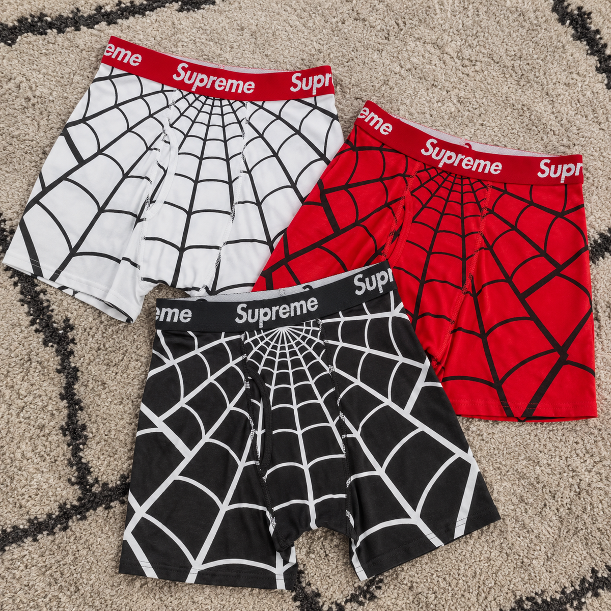
Supreme Hanes Spider-Man Boxer Briefs 2 Pack White, Red, and Black turn the same Hanes base into three different readings of the Spider-Man graphic. All three belong to Supreme’s SS26 release and use an all-cotton classic Hanes boxer brief with an elasticated logo waistband. The real difference is visual: White makes the web artwork feel the sharpest, Red connects most directly to Spider-Man’s familiar color language, and Black inverts the contrast for the darkest version. If you are choosing only one pack, the best option depends on whether you want the graphic to look clean, character-driven, or more subdued.
The Collaboration Starts With a Familiar Hanes Base
Supreme’s official SS26 preview identifies the release as an all-cotton classic Hanes boxer brief. That matters because the product is not trying to reinvent the underwear silhouette. The collaboration works by taking a familiar everyday basic and changing the surface through Spider-Man graphics and Supreme branding.
Each colorway is sold as a two-pack, and reliable product listings confirm the elasticated logo waistband across White, Red, and Black. That keeps the core construction consistent while the base color and printed artwork do the visual work.
The official Supreme SS26 preview is the clearest reference for the all-cotton Hanes construction shared by the release.
White Gives the Web Graphic the Cleanest Contrast
On the White pack, the lighter base makes the printed web treatment easier to read immediately. Product imagery shows dark web graphics against the white body, so the Spider-Man reference is visible without needing a bright garment color.
This version makes sense if you like the collaboration because of the graphic itself. The white base behaves almost like a blank page, giving the web pattern, spider imagery, and Supreme waistband more separation.
White is the strongest choice when you want the design to look crisp and graphic-first.
Red Pushes the Spider-Man Reference Furthest
Red changes the mood because the base color already belongs naturally to Spider-Man’s visual world. The black web and spider details sit against a red body, so the collaboration reads less like a Hanes basic with a licensed print and more like a direct character color treatment.
That makes Red the most obvious choice for someone buying because of the Spider-Man connection rather than simply because it is a Supreme x Hanes release. The color does part of the storytelling before the graphic is even examined closely.
Red is the most character-driven version of the three.
Black Turns the Graphic Into an Inverted Web
Black takes the opposite approach from White. Product imagery shows a dark body with a light web pattern, creating a stronger inverted effect. The result feels more graphic than a standard black underwear pack while still keeping the overall color direction dark.
This is useful for buyers who want the collaboration but do not want Red to dominate the piece. Black keeps the Spider-Man theme visible through contrast while making the base color the easiest of the three to place inside an otherwise dark wardrobe or travel rotation.
Black is the most restrained color choice without becoming visually plain.
The Three Packs Share the Same Release Story
White, Red, and Black were all released for Spring/Summer 2026 on April 23, 2026. Their color-specific SKUs are SS26A66 WHITE, SS26A66 RED, and SS26A66 BLACK, while the cotton construction and elasticated logo waistband remain consistent across the group.
That common release context matters because none of the three is a separate concept. They are three color executions of the same Supreme, Hanes, and Spider-Man idea. The decision should therefore stay focused on the visual role of the base color rather than assumed differences in fit or fabric.
If You Plan to Wear Them, Choose by Graphic Intensity
For an everyday rotation, Black is the easiest route if you want the Spider-Man graphic without making the base color the main feature. White gives you the clearest graphic separation, while Red makes the collaboration feel the most expressive.
Because the construction is shared, there is no reason to invent a performance hierarchy between them. The practical decision is mostly about how much visual character you want from an item that still starts as a classic Hanes boxer brief.
That makes Black the safe dark option, White the clean graphic option, and Red the strongest Spider-Man option.
If You Are Collecting the Collaboration, Color Changes the Story
The same three-way split also matters for a collector. White emphasizes the printed web, Red emphasizes the character association, and Black creates the strongest reverse-contrast look. Owning more than one color is therefore not simply duplicating the same pack in a different shade; each version changes how the Spider-Man artwork is read.
The two-pack format also keeps the collaboration close to the familiar Supreme x Hanes basics category rather than turning it into a novelty-only item. That balance between everyday product and pop-culture graphic is what makes the release distinctive.
Choose the Pack by What You Want to Notice First
If the first thing you want to notice is the web artwork, choose White. If you want the color itself to carry the Spider-Man reference, choose Red. If you want the collaboration inside a darker, more understated base, choose Black.
You can compare the current Supreme Hanes Spider-Man boxer brief arrivals at AFewVibe after deciding which of those three roles matters most to you.
The best pack is not determined by construction because the core formula is shared. It is determined by emphasis: White highlights the print, Red highlights the character, and Black highlights the contrast.
Share:
Essentials MLB Hoodies Pick Your Baseball Code