


Not Every Graphic Tee Needs to Do the Same Job
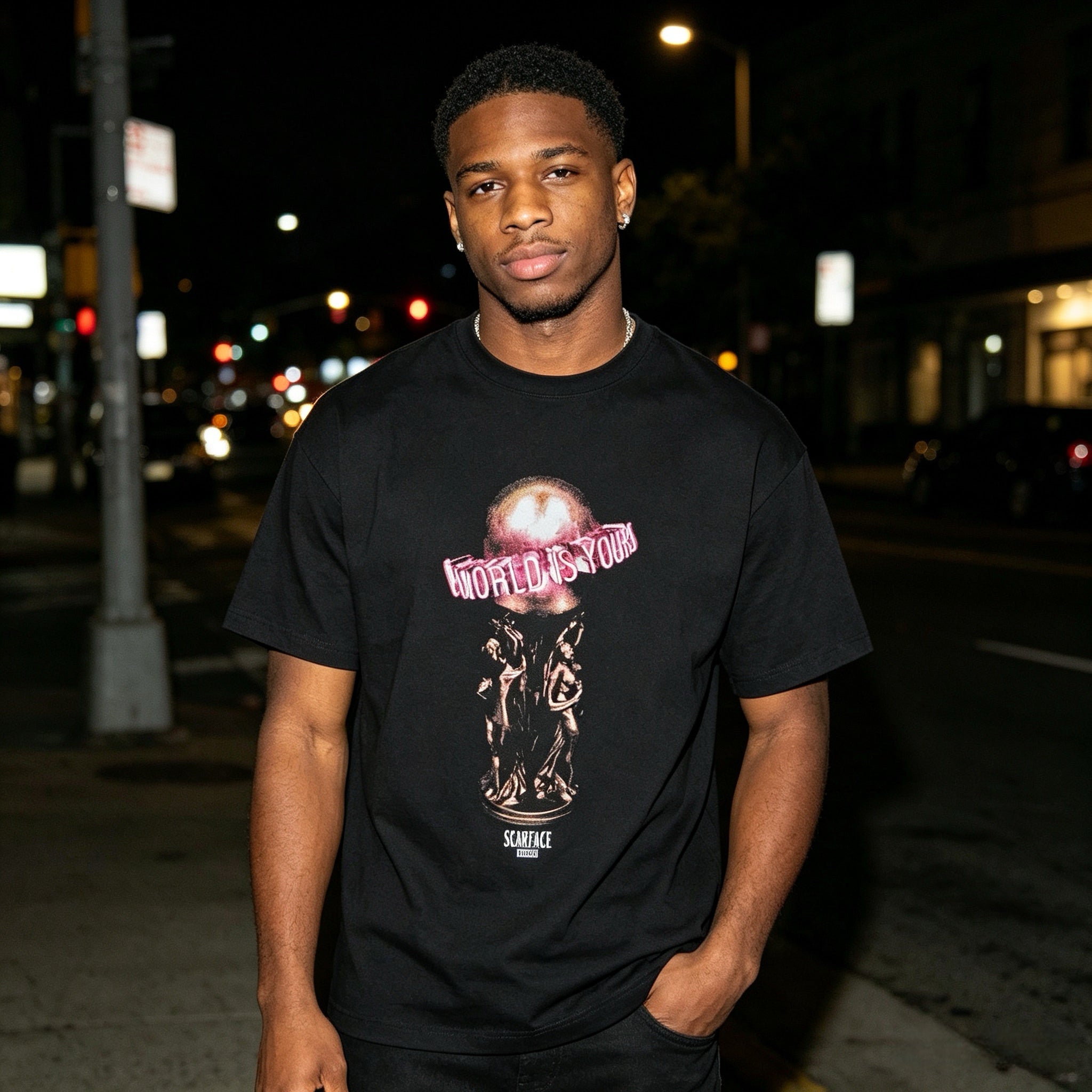
Some graphic tees are built to fill space. Others are strong enough to lead the whole outfit. Kith x Scarface The World Is Yours Tee Black feels closer to the second type. It works best for someone who wants the shirt to carry the attitude, not just sit under a jacket and disappear.
That matters because black graphic tees are easy to overbuy and hard to differentiate. A lot of them land in the same zone: dark base, familiar image, quick initial impact, then not much else once you try to style them. This one has a better reason to stay in rotation. The Scarface reference brings instant recognition, but the real value is how that reference sits on a black tee. It gives the piece enough visual pull to anchor a fit without forcing the rest of the outfit to become costume-like.
Why Kith x Scarface The World Is Yours Tee Black Works Better in Real Outfits
The easiest mistake with a tee like this is assuming more statement automatically means more outfit. Usually it means the opposite. When the front graphic already carries weight, the rest of the look needs cleaner support. That is what makes this kind of shirt useful. You do not need extra noise. You need shape, spacing, and the right texture around it.
Kith’s Scarface collection was built around artwork from the film, while Kith’s own tee program also spans several silhouettes and graphic-driven styles, which helps explain why this release lands more like a wearable culture piece than a basic printed top. For readers who want the official collection context, the Kith Scarface capsule is a helpful reference point: Kith for Scarface.
On body, the black color does a lot of the work. It keeps the graphic from feeling too loud in daylight and gives the tee more range after dark. That makes it easier to style across different moods. In one outfit, it can read like a film nod with clean streetwear energy. In another, it can feel heavier, more nostalgic, and more deliberate. The base color gives you room to decide which direction to take.
Who This Tee Makes Sense For
This is a stronger buy for someone who likes graphic tees but does not want a random archive of prints that all serve the same purpose. It makes sense if your wardrobe already has plain black tees covered and you want one option with more identity. It also makes sense if you wear wider pants, workwear denim, washed cargos, or cleaner sneakers and need a top that can hold that shape together.
It is less about chasing a loud movie reference and more about knowing when to use one. If your outfits are usually built around outerwear, this can still work, but it shines more when the tee remains visible. The graphic needs space. That means open overshirts, lighter jackets, or no top layer at all will usually make more sense than burying it under a dense mid-layer stack.
How to Style the Graphic Without Overbuilding the Fit
The best starting point is simple: let the tee set the tone, then keep the lower half grounded. Black washed denim is the safest move, but not always the most interesting one. Faded blue denim gives the outfit more contrast and brings out the vintage side of a film graphic better. Olive cargos shift the look into something rougher and more everyday. Charcoal sweatpants can work too, but only if the shoes and outer layer keep the fit from falling flat.
Footwear matters more here than accessories. Clean leather sneakers make the tee feel sharper. Bulkier retro runners make it feel more casual and collector-driven. If you want the outfit to lean street instead of merch-like, focus on silhouette before you add anything else. Wider leg openings, slightly heavier pants, and cleaner footwear usually beat extra chains, hats, or stacked graphics.
For readers browsing similar pieces, it makes sense to pair this kind of statement tee with other streetwear-focused tops that keep the same balance between identity and wearability. The broader Kith collection at AFV is the most natural place to keep that comparison in one lane.
What to Pay Attention to Before You Buy
With a piece like this, the key question is not whether you like Scarface. It is whether you want your tee to be the first thing people read in the outfit. If the answer is yes, this kind of release gives you more mileage than a plain logo tee because it already creates a focal point. If the answer is no, then you may wear it less often than expected, even if you like the collaboration in theory.
It also helps to think about frequency. This is not the type of black tee most people wear on autopilot three times a week. It is the one you reach for when the rest of the outfit is quiet and you want one item to change the whole energy. That is why it earns its spot differently. It is not the base layer. It is the conversation starter.
Keeping It Looking Right Over Time
Graphic tees usually age better when they are treated like printed pieces instead of throwaround basics. Washing inside out, using cooler water, and skipping harsh heat are the easiest ways to protect the graphic surface and keep the black base looking cleaner longer. That kind of care matters more on a tee where the front artwork is the entire point.
The bigger takeaway is simple. This is a black graphic tee for people who want more than a logo but less than a costume. It carries a film reference with enough weight to matter, yet it still fits naturally into modern streetwear rotation. If you know how to give the graphic room and keep the rest of the outfit disciplined, this is the kind of piece that does more than just fill a hanger.
Share:
Kith For Nanzuka Gallery Sorayama Model A Stitch Tee Black — Mechanical Art, Dark Frame
YOHJI YAMAMOTO x NEIGHBORHOOD SS-2 Black and White Tee Rotation