
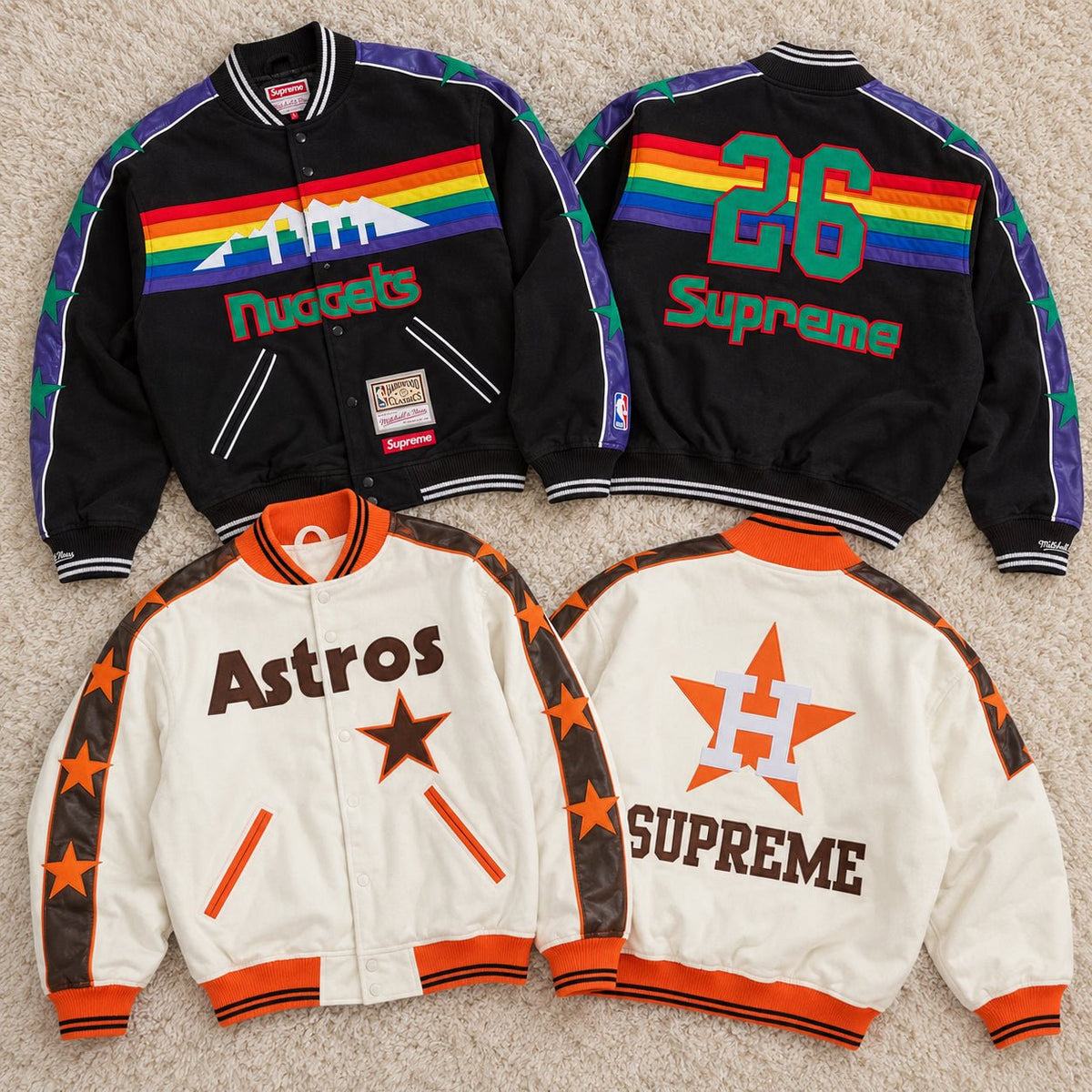
Supreme Mitchell & Ness Teams Varsity Jacket Natural and Supreme Mitchell & Ness Teams Varsity Jacket Black are more interesting when viewed as varsity jackets first and color options second. The appeal comes from how traditional sports outerwear construction, official team imagery, and Supreme’s streetwear context meet in one piece. Wool-blend fabric, felt appliqué, leather sleeve stripes, striped ribbing, embroidery, and a snap front give the jacket the visual language of classic team apparel before Natural or Black changes the mood. For buyers deciding between the two, understanding that construction explains more than simply asking which color is easier to wear.
The Construction Carries the Varsity Identity
Supreme’s official specification lists a wool-blend shell with fill and quilted satin lining. That combination gives the jacket a more structured outer appearance while keeping a distinct interior finish associated with traditional varsity and sports jackets. The snap front reinforces that language more convincingly than a standard zipper would, while double-welt hand pockets keep the lower front relatively clean around the heavier graphic treatment.
The details become more expressive around the edges. Striped ribbing runs through the collar, cuffs, and hem, creating the visual boundaries expected from a varsity silhouette. Felt appliqué appears across the front and back, while leather stripes at the sleeves introduce another material surface and carry additional felt work.
The official Supreme Teams Varsity Jacket page also confirms embroidered cuff logos and a woven Supreme and Mitchell & Ness label at the lower front. These are not isolated decorations. Together, they create the layered construction that makes the jacket read as sports heritage rather than a basic coat covered in logos.
Felt, Leather and Embroidery Create the Visual Depth
A printed team graphic could communicate the same franchise name, but it would not create the same surface. Felt appliqué gives lettering and team imagery physical edges and dimensional separation from the wool-blend body. Embroidery adds another type of texture at smaller points such as the cuffs, while the leather sleeve stripes visually divide the sleeves from the body.
That mix is important because varsity jackets have historically relied on decoration as part of their construction. The patches, lettering, ribbing, and contrasting sleeve treatments are not simply graphics placed on top of a finished silhouette; they are part of how the silhouette is recognized.
This is why both colorways can remain visually strong without needing an all-over print. Much of the character comes from how different materials and techniques sit beside one another.
The Shape Comes From Traditional Sports Outerwear
The snap front, ribbed boundaries, substantial body, and decorated sleeves give both versions a classic varsity proportion rather than the flatter appearance of a lightweight coach jacket or simple bomber. It is a silhouette designed to carry large lettering and team imagery across broad areas of the garment.
That matters when choosing a size. These jackets are sold in men's sizing. Buyers who usually wear women's sizing, prefer a close silhouette, or have a smaller frame may find their normal letter size looks roomier than expected. At the same time, some of that space can make sense if the jacket is worn over a sweatshirt or hoodie.
Rather than automatically sizing down, compare the garment measurements with a jacket you already own. A varsity jacket can look intentionally substantial without needing to become excessively oversized.
Mitchell & Ness Brings the Sports Archive
Mitchell & Ness has built much of its modern identity around throwback professional sports apparel, using past team identities and retro sports design as a connection to earlier eras of MLB, NBA, and other American leagues. Its own brand presentation emphasizes throwback and retro apparel as a way of revisiting team history.
That background matters here. The Supreme collaboration is not borrowing a generic collegiate aesthetic and inventing fictional team patches. The SS26 collection incorporates official MLB and NBA merchandise and draws on recognizable franchise identities across the wider capsule.
Varsity jackets are therefore a particularly logical meeting point for the two brands. Mitchell & Ness brings the visual vocabulary of licensed American sports history, while Supreme places those references into a contemporary streetwear collection.
Supreme Changes the Context Without Erasing the Source
Supreme has long treated sports uniforms and functional garments as streetwear rather than restricting them to their original setting. In this collaboration, the team imagery remains recognizable, but the way it is distributed across wool, felt, leather, embroidery, and Supreme co-branding changes how the jacket can be read.
It can still function as sports merchandise, but it also works as a heavily constructed graphic outerwear piece. That crossover is the cultural value of the collaboration: team history does not sit separately from streetwear culture. The two overlap in one garment.
The jacket is strongest when that relationship is visible. Removing the appliqué, striped ribbing, or team references would also remove much of what makes the collaboration specific.
Natural Lets the Craft Read More Clearly
On the Natural version, the lighter body gives the appliqué, sleeve stripes, lettering, and team colors more visual separation. Individual construction details are easier to read from a distance because the background does not absorb them.
That makes Natural particularly effective if you are drawn to the jacket because of the patchwork quality and vintage sportswear references. With dark denim, black trousers, or charcoal pants underneath, the lighter jacket retains a clear outline and lets the surface details remain the focal point.
Natural treats the varsity jacket almost like a display surface for the different materials and team graphics.
Black Makes the Varsity Shape Feel More Unified
Black changes the same construction without removing it. Felt, embroidery, ribbing, and sleeve details remain important, but the darker base brings the jacket together into a more unified block.
That can make the varsity silhouette itself feel stronger. Instead of noticing the body color first and then reading each patch, the eye can register the dark jacket as one shape before moving into its team details.
For buyers who already wear black denim, dark hoodies, grey sweats, or darker sneakers, this version also connects the traditional varsity construction to an existing streetwear wardrobe without requiring the jacket to become the brightest part of the outfit.
The Better Choice Depends on What You Value in the Collaboration
If the craftsmanship is what attracts you—the felt appliqué, contrasting materials, team lettering, sleeve construction, and retro sports character—Natural makes those differences more immediately visible. If you want the same construction and cultural reference inside a darker, more integrated silhouette, Black makes more sense.
You can view both Supreme outerwear options in the current AFewVibe selection once you have decided which interpretation of the varsity format fits your wardrobe.
Either way, color is only the final layer of the decision. The real identity of the Supreme Mitchell & Ness Teams Varsity Jacket comes from the combination of wool-blend construction, appliqué work, leather detailing, traditional varsity proportions, official sports iconography, and two brands approaching American sports culture from different directions.
Share:
Where Each Stussy Skullcap Fits
Four Sp5der V2 Hoodies Through Print and Construction