

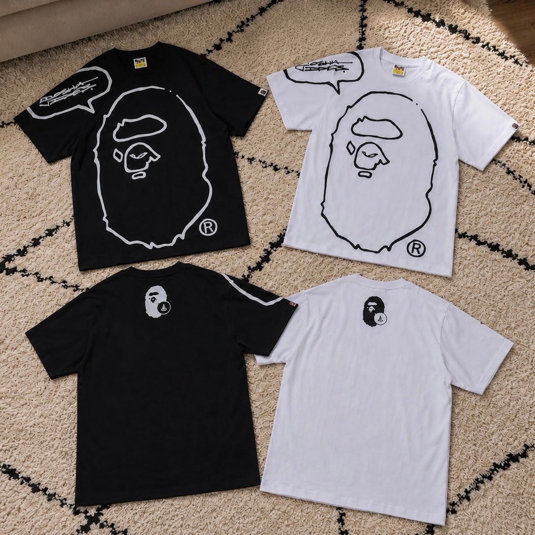
The easiest way to choose between these two tees is to decide how much contrast you want around the Ape Head graphic. The BAPE x Joshua Vides Ape Head Tee White makes the artwork feel sharper, brighter, and closer to a sketch on paper. The BAPE x Joshua Vides Ape Head Tee Black turns the same collaboration language into a darker, more integrated streetwear piece.
Both come from BAPE’s Spring/Summer 2024 project with Joshua Vides. The collection reworked familiar BAPE graphics through Vides’ studio-driven visual language, including brush-like marks and stencil-inspired treatment. BAPE also connected the apparel concept to vintage Ape Head tees printed at a larger scale. That background matters because these are not simply standard logo tees in two colors. They are two ways to wear the same reinterpreted icon.
What Actually Changes Between White and Black?
The artwork stays within the same monochrome world, but the base color changes the entire mood. White creates separation between the tee and the graphic. The Ape Head reads quickly, making the piece feel more graphic-led and more noticeable in daylight. It works especially well when the rest of the outfit uses black, gray, faded blue, or muted green.
Black reduces that visual gap. The light linework still stands out, but the tee feels more connected to darker pants, jackets, and sneakers. Instead of looking like a bright canvas carrying artwork, it becomes part of an all-black or washed-neutral outfit. The black version is easier to keep understated from a distance, even though the collaboration details remain recognizable up close.
Choose White for a Cleaner Graphic Statement
The white version is the stronger choice when you want the collaboration artwork to lead immediately. Its contrast gives the Ape Head a drawn, poster-like quality. It can replace a louder multicolor graphic tee while still creating a clear focal point.
For a warm-weather outfit, wear it with loose black shorts, white socks, and simple black sneakers. The limited palette lets the graphic stay central without making the outfit feel overworked. For a second direction, pair it with faded denim and a dark cap. That combination makes the white tee feel less polished and more naturally worn into a daily streetwear rotation.
White also makes sense for buyers who already own several black BAPE tees. It adds a different base color without leaving the familiar Ape Head category. Browse the wider BAPE selection at AFewVibe to compare how this collaboration sits beside more traditional logo and camo designs.
Choose Black for Easier Everyday Integration
The black version is the safer pick when your wardrobe already leans dark. It works with washed black denim, charcoal trousers, olive cargos, or pale neutral pants without forcing a new color direction. The graphic remains visible, but the overall outfit feels less separated into “tee” and “bottom.”
One useful styling route is a black-on-black fit with different surface tones. Combine the tee with faded jeans and cleaner footwear so the white linework becomes the brightest element. Another option is to wear it under an open gray or olive overshirt. The outer layer frames the front artwork while preserving the black base as the outfit’s anchor.
The black tee is also easier for evening wear. Under lower light, the body color blends into jackets and trousers, while the graphic catches attention in smaller moments. That makes it a better choice for buyers who want collaboration value without building every outfit around a bright white top.
The Collaboration Matters More Than the Color
Vides’ treatment reduces familiar graphics into high-contrast, hand-drawn-looking forms. In this project, that approach meets one of BAPE’s most recognizable symbols. The result keeps the Ape Head readable while making it feel less like a standard recurring logo treatment.
BAPE’s official collaboration overview explains that the collection combines the artist’s studio process with classic brand graphics. That is the real reason to consider either tee. The color decision changes styling, but both versions offer a more art-directed take on a logo many streetwear buyers already know.
Which BAPE x Joshua Vides Ape Head Tee Should You Buy?
Choose white when you want maximum graphic clarity, stronger summer contrast, or a break from a mostly black tee rotation. Choose black when you want easier layering, darker outfit continuity, and a collaboration piece that does not dominate every look.
Neither color is automatically better. The white version behaves like a statement graphic tee. The black version behaves like a dark wardrobe staple with a distinctive collaboration layer. Your best choice depends on whether you want the Ape Head to separate from the outfit or sit naturally inside it.
Share:
Four Eric Emanuel Shorts Compared by Outfit Impact
Derschutze Yasmin V3 Jorts Tinted Denim Shorts The Statement Pick