
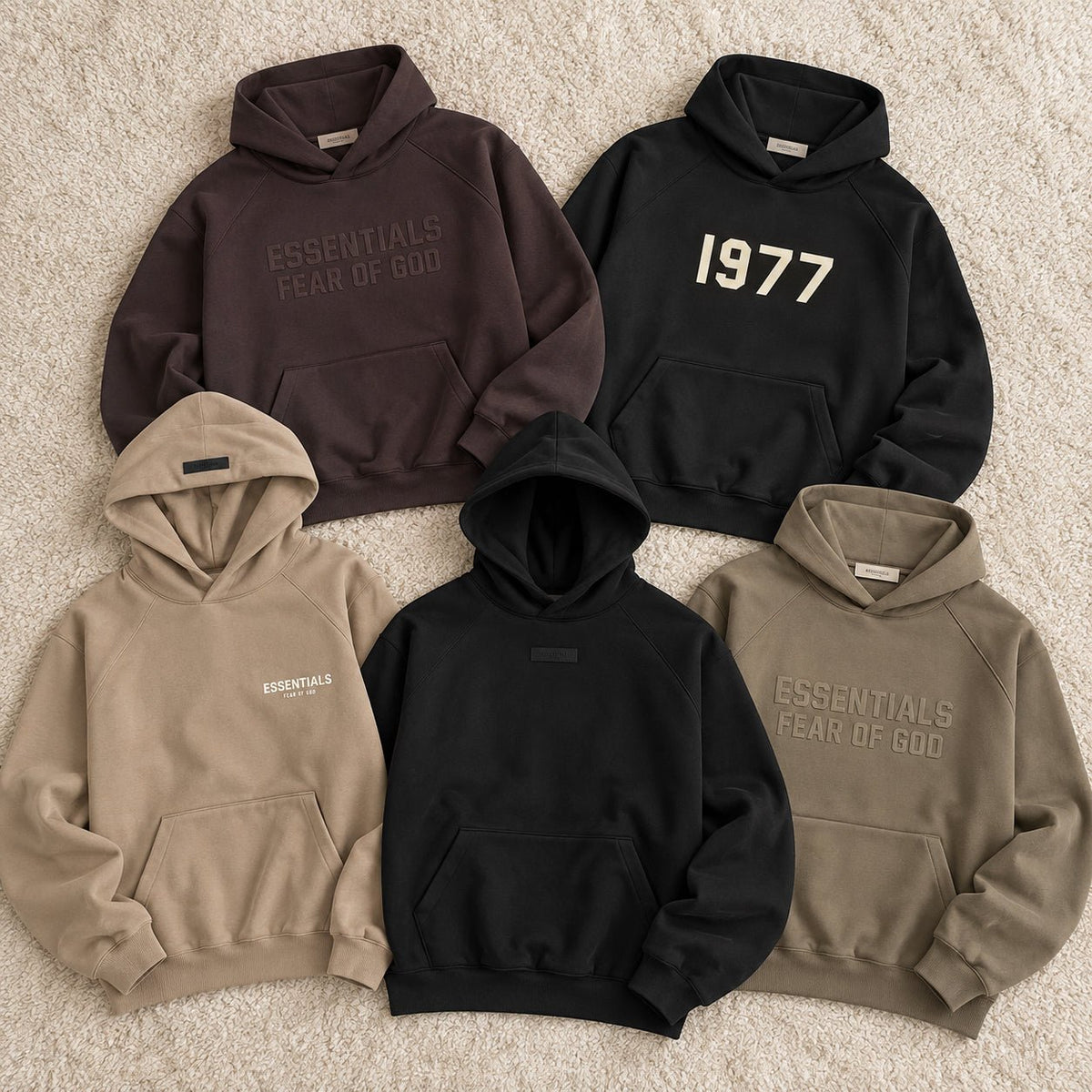
Fear of God Essentials Hoodie Plum, Fear of God Essentials 1977 Hoodie Iron, Fear of God Essentials Hoodie Desert Taupe, Fear of God Essentials Hoodie Jet Black, and Fear of God Essentials Hoodie Wood do more than offer five color choices. Taken together, they show how the Essentials hoodie changed across several seasonal drops: from familiar kangaroo-pocket pullovers and statement front graphics to a rounder, more sculpted body with a mock neckline and side-seam pockets. That makes this group useful as a small design timeline rather than another neutral-color ranking.
Spring 2022 still speaks the language of the classic pullover
The Desert Taupe hoodie gives the clearest starting point. It uses a hooded pullover format with a kangaroo pocket, ribbed trims, a small chest logo, and a rubberized hood label. The design is recognizable because the familiar sweatshirt architecture remains intact while the muted brown-beige color keeps the branding relatively quiet.
The 1977 Hoodie Iron comes from the same Spring/Summer 2022 season but changes the message dramatically. Instead of making the standard Essentials name the main front cue, it puts “1977” across the chest. The result is still a straightforward hooded pullover, yet the graphic gives the piece a stronger vintage-athletic reference and makes the season feel less purely minimal.
These two pieces are useful together because they show that Essentials was already operating with more than one kind of “basic.” Desert Taupe keeps the silhouette familiar and lets color do much of the mood-setting. Iron keeps the dark neutral base but turns the front graphic into the main event.
Fall 2022 shifts the emphasis toward the hoodie as a staple
Fear of God Essentials Hoodie Wood continues the hooded pullover formula with a kangaroo pocket, ribbed trims, chest branding, and a rubberized hood label. The important change in this five-piece timeline is not a radical new construction. It is how the garment reads as a wardrobe staple rather than a single graphic moment.
Wood sits in the earthy part of the Essentials palette, so the piece can work with cream, olive, faded denim, and dark brown without needing high contrast. That makes the hoodie useful as a bridge between the more graphic Iron release and the later pieces that start to change the silhouette itself.
This is where the timeline becomes more interesting than a simple year-by-year list. Not every new season needs a completely new hoodie body. Sometimes the design language stays familiar while the color, branding scale, and surface treatment shift the role the garment plays.
Plum shows how color can refresh a familiar formula
The Fear of God Essentials Hoodie Plum arrives in Spring/Summer 2023 with an oversized pullover shape, attached hood, kangaroo pocket, ribbed cuffs and hem, front Essentials graphic, and rubber hood label. Structurally, it still belongs to the recognizable Essentials hoodie family.
What changes is the amount of color the hoodie brings into the wardrobe. Plum pushes beyond the beige, brown, grey, and black territory that often defines Essentials styling, while keeping the same broad casual language. That means the piece can feel new without depending on a completely redesigned construction.
In this timeline, Plum matters because it shows another way a recurring silhouette can evolve. Instead of adding more hardware or changing the pocket system, the brand can alter the visual experience through a deeper, more chromatic base. For a shopper, that is a useful distinction: sometimes the reason to choose a later drop is a new shape, and sometimes it is simply a familiar shape with a different role in the wardrobe.
Jet Black marks the biggest structural break in this group
Fear of God Essentials Hoodie Jet Black is the point where this five-piece comparison changes most clearly. The Spring/Summer 2024 style uses heavyweight core fleece in a relaxed, round cropped body with a mock neckline, side-seam pockets, ribbed cuffs and waist, and a minimal rubberized black bar at the center front.
The pocket change alone alters the front of the garment. Removing the visible kangaroo pocket leaves a cleaner surface, while the side-seam pockets preserve function without interrupting the torso. The mock neckline also changes how the hood meets the body, giving the top of the hoodie a more compact frame.
That combination makes Jet Black feel less like another color update and more like a different interpretation of what an Essentials hoodie can be. The branding gets quieter while the shape gets more deliberate. Instead of asking the logo to create recognition, the rounded volume, cropped proportion, neckline, and cleaner front begin to carry more of the identity.
The five pieces reveal three different ways a hoodie can change
Look at the group as three editorial phases rather than five isolated products. The 2022 pieces show the classic pullover idea being adjusted through graphic scale and muted color. Plum shows how a familiar hoodie formula can be refreshed through a stronger color direction. Jet Black shows a larger construction shift, where the neckline, pocket placement, and body shape become more important than a large front message.
That framework also changes the buying question. If you like the traditional Essentials hoodie experience, Desert Taupe, Wood, Plum, and the 1977 Iron keep you closer to the familiar hooded pullover format. If you are more interested in the line’s move toward a cleaner, sculpted body, Jet Black is the outlier worth studying.
There is no need to treat one phase as automatically better than another. A kangaroo-pocket hoodie can be more useful for someone who wants a recognizable sweatshirt structure. A mock-neck, side-pocket version can make more sense for someone who wants a cleaner front and a different proportion. The point is that these five releases let you choose by design direction, not only by shade.
Buy the design moment that matches your wardrobe
If you are choosing among all five, start with the kind of Essentials hoodie you actually want to wear. Pick Desert Taupe when you want a classic muted neutral, Iron when the 1977 graphic is part of the appeal, Wood when an earthy staple fits your rotation, and Plum when you want the familiar formula with more color.
Choose Jet Black when the newer shape is the reason you are interested: the round cropped body, mock neckline, side-seam pockets, and minimal front branding create a noticeably different proposition from the earlier pullovers in this group.
Seen this way, the five hoodies are not just a row of seasonal colorways. They are a compact record of how Essentials can change a staple without abandoning the hoodie category itself. That is the more useful comparison because it helps you decide whether you are buying a color, a graphic moment, or a genuinely different silhouette.
Share:
Kith Nelson Pullover Between Casual and Polished