


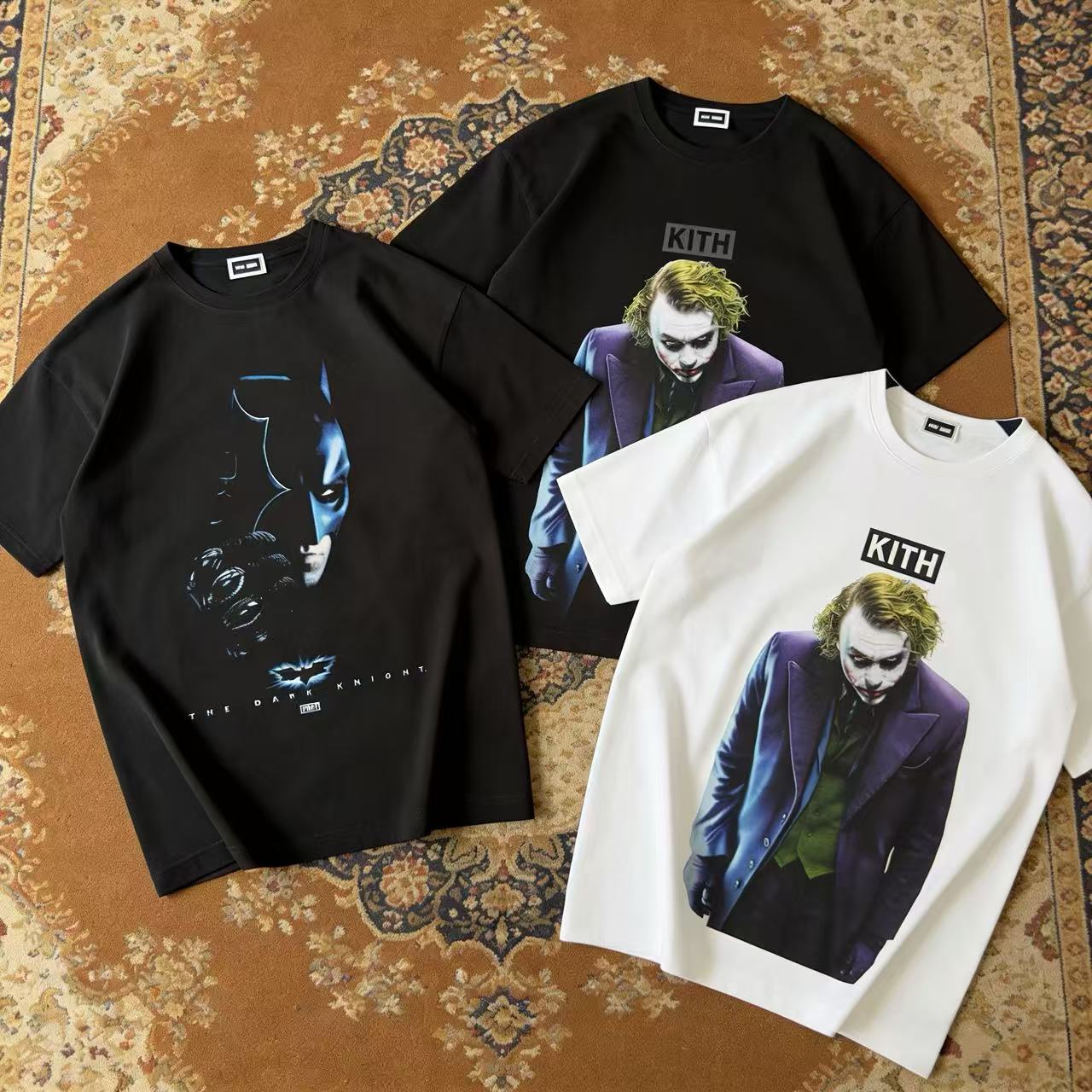
Not every licensed graphic tee earns space in a real wardrobe. Some are easy to like and hard to style twice. This set works differently. The Kith x Batman Joker Tee Black, Kith x Batman Joker Tee White, and Kith x Batman Dark Knight Vintage Tee Black all come from the same Batman capsule, but they solve different outfit problems. That is the right way to shop them. Do not start with “Which graphic is coolest?” Start with “Which one fits how I actually dress?”
That question matters because these three tees do not create the same kind of presence. The two Joker tees are cleaner and more immediate. They rely on one front image and let the shirt color decide the mood. The Dark Knight Vintage tee feels more cinematic because it carries a front image and a back image, so it keeps telling the story even after you turn around. Kith’s Batman capsule itself leaned into film graphics and vintage tees tied to key characters and movie moments, which gives this trio a stronger archive feel than a basic logo drop through the official collection overview.
The easiest lane: Joker Tee Black. This is the safest pick for buyers who want a graphic tee that still behaves like a daily black tee. The dark base controls the energy of the artwork. Joker still lands hard, but the shirt does not feel loud in every setting. It works with washed denim, black cargos, straight olive pants, and almost any darker outer layer. If your closet already leans neutral or monochrome, this version gives you character detail without forcing the whole outfit to revolve around one shirt.
There is also a specific visual advantage to the black base. Public product details point to a 230GSM cotton jersey build and a large front Joker image with Kith branding above it, which means the shirt already has graphic weight before you even style it. On black, that weight feels tighter and more controlled, not as exposed as it does on white. That makes it a better choice for night wear, travel outfits, and repeat rotation through colder months, when the tee may sit under a zip hoodie, bomber, or overshirt and still keep its edge. For shoppers who want to stay inside the same brand language, browsing the wider Kith selection here makes sense before settling on one graphic direction.
The brighter lane: Joker Tee White. This one proves that a color swap can change the entire use case. The same Joker artwork reads faster and louder on a white base. The contrast is sharper, the graphic is easier to notice from a distance, and the whole tee feels more open in daylight styling. If you wear lighter denim, stone shorts, vintage wash blue jeans, or off-white sneakers, the white version tends to integrate more naturally than the black one.
The value of the white version is not that it is “more wearable” in a generic sense. It is that it creates a different kind of outfit balance. When your bottoms are already simple, the white base gives the upper half more lift. That can matter in warm-weather fits where you are not layering much and the tee has to carry the entire look on its own. Public release details also tie this version to the same November 22, 2024 Batman capsule and the same 230GSM jersey structure, so the real decision is not fabrication. It is visual output. Choose Joker White when you want the graphic to read quickly and clearly, not subtly.
The statement lane: Dark Knight Vintage Tee Black. This is where the trio stops being a color choice and becomes a format choice. The Dark Knight Vintage tee does more because it gives you a front graphic and a back graphic. Public product listings describe a close-up Batman image on the front with The Dark Knight and Kith branding, plus a Joker reverse graphic holding a Batman playing card. That combination changes how the piece works in motion. It matters when you walk into a room, take off a jacket, or wear the tee as the only graphic element in the fit. The shirt does not spend its entire life facing forward.
That front-and-back structure gives it more collector energy, but it also gives it more styling purpose. This is the best option if you like open layers, because an unzipped hoodie or overshirt can frame the front image, while the back artwork takes over later in the day. It also makes more sense for buyers who see graphic tees as centerpiece items rather than filler basics. You are not buying another black tee here. You are buying a shirt that carries more of the film mood by itself.
How the buying decision really breaks down. Pick Joker Tee Black if your priority is rotation value. It is the easiest one to wear often without getting tired of the graphic. Pick Joker Tee White if your priority is contrast and visibility. It turns the same character into a brighter styling move. Pick Dark Knight Vintage Tee Black if your priority is narrative impact. It gives you the strongest tribute feeling and the most visual payoff from multiple angles.
There is also a difference in who each one serves. The black Joker tee is for the buyer who wants graphic energy inside an otherwise restrained wardrobe. The white Joker tee is for the buyer who wants one shirt to lift a cleaner outfit. The Dark Knight Vintage tee is for the buyer who wants the tee to act like the event. That distinction sounds small on paper, but it is the difference between a shirt that sits in your drawer and a shirt that keeps getting picked.
That is why this group works as more than franchise merch. Kith did not just print Batman images on blank tees. The capsule framed these pieces through film nostalgia, character recognition, and vintage tee positioning, and that gives each option a more specific role. Once you shop them by role instead of by fandom alone, the choice becomes much easier, and each tee starts to justify itself in a different wardrobe.
Share:
BAPE Graphic Tee Edit — Check Neutrals and Color Camo Contrast
Kith x Scarface Montana Power Tee Black — Screen Legend, Daily Uniform